ML Lifestyle
Fitness, nutrition, and personal training company, ML Lifestyle was founded on one woman's vision for living a healthy lifestyle, and a passion for helping others to fall in love with it, too. Meghan, a trainer with an addiction to fitness, had been helping clients from all kinds of athletic backgrounds to achieve their goals. With numerous clients excited about her business, she knew it was time to go all in on a visual identity that would help her grow the company.
A Brand that Strikes Balance
Having a diverse client base is healthy for business, but also challenging when building a logo that will need to resonate with them. The brand would need to be hardcore enough that athletes and fitness fiends would be attracted to ML, but it had to be friendly enough not to alienate those who were just starting out. We were able to craft an identity that would stand out against the flooded market and make fitness-seekers feel welcome and supported, no matter what their journey might entail.
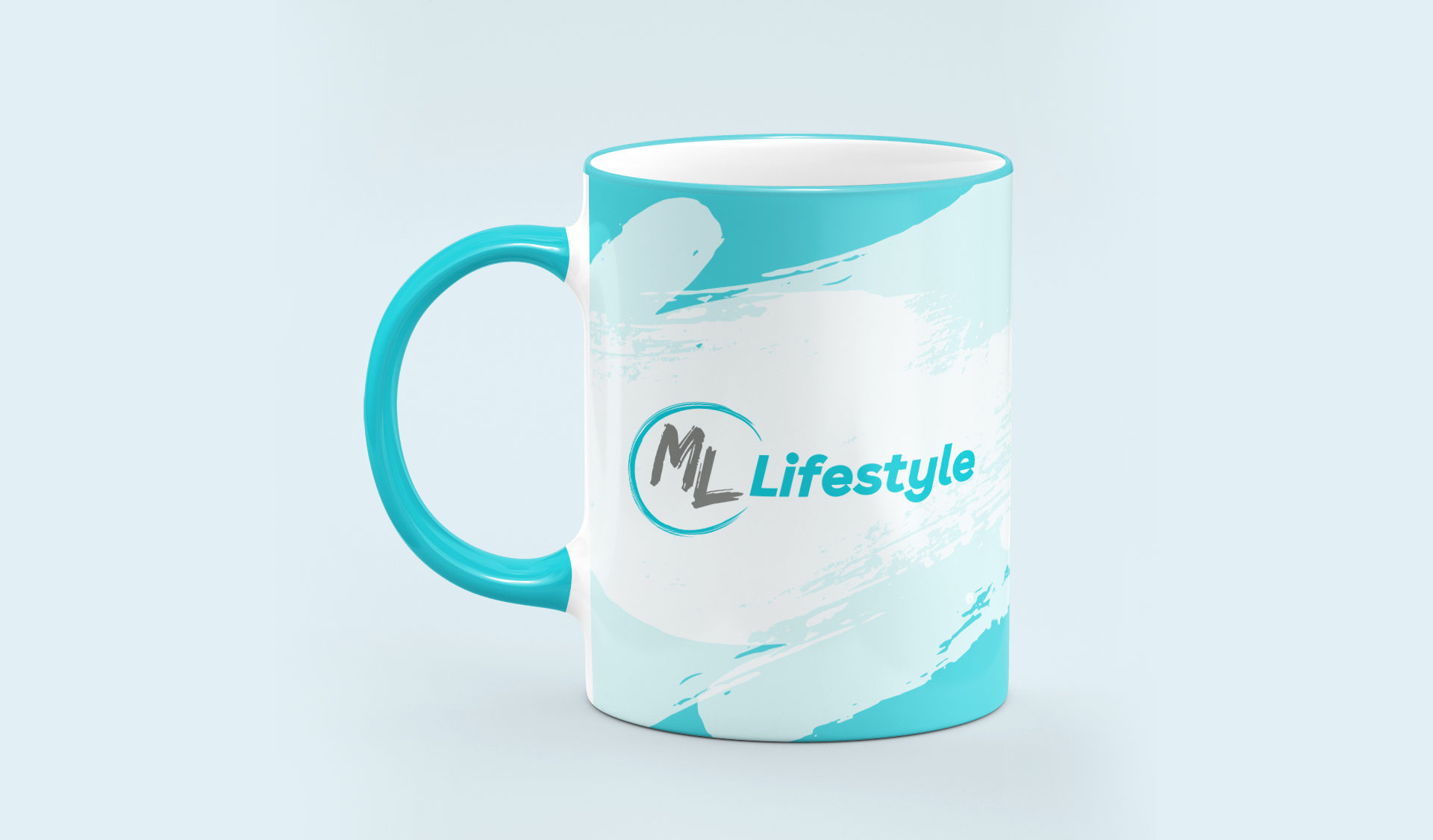
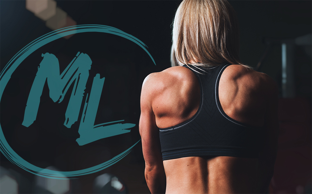
The icon’s swoop element helps to indicate that fitness is not a linear process, but a cyclical one which so many factors play into. The swoop also represents the many services offered (nutrition, training, coaching, etc.) that make for a holistically healthy lifestyle.
We landed on a fresh teal colour palette that would be lively and inviting. This palette and the brush-stroke typeface help to differentiate ML Lifestyle from the many aggressive, masculine fitness brands in the Edmonton trainer landscape. The supporting graphics feature a grunge-style effect that adds a feeling of power to them without weighing down the overall aesthetic.