Roc Electrical
With over a decade of experience in the electrical world, Brad decided it was time to develop his own company that would provide central Alberta with incredible service. His company, ROC Electrical, would need a visual identity that was vibrant enough to resonate in the marketplace, but professional enough to expand reach into new markets.
Designing with the Future in Mind
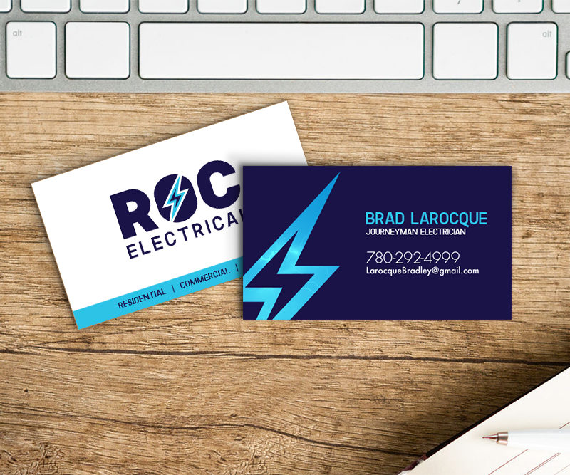
We helped Brad to develop a name for his business that would strike a chord in the marketplace. We came to the name ROC Electrical, a play on Brad’s last name, Larocque. The name ROC achieves the symbolism of a rock, and the result is a company name that signifies stability and reliability, two incredible trustworthy traits that are valuable to have associated with any brand.
It was especially important that the logo encompass a professional angle due to the fact that much of the work coming to ROC Electrical would be business-to-business rather than working directly with a customer. However; the company still had to have an approachable feel that wouldn’t hinder the growth of homeowner contacts and referrals.
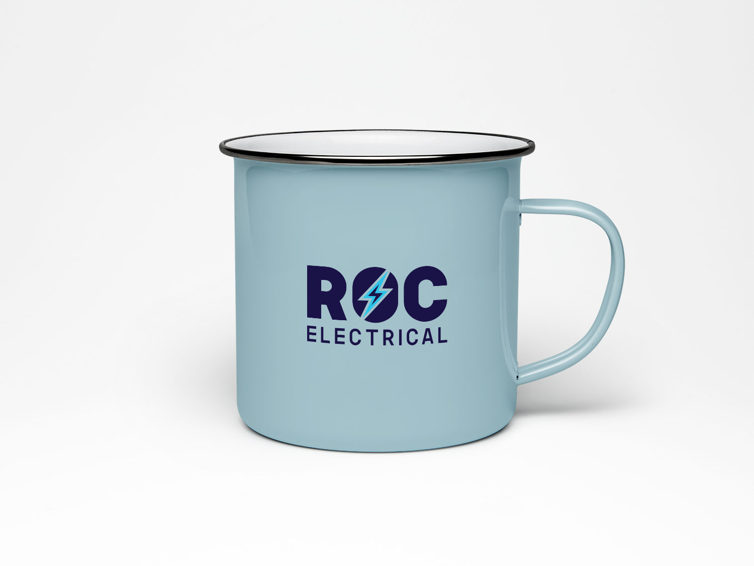
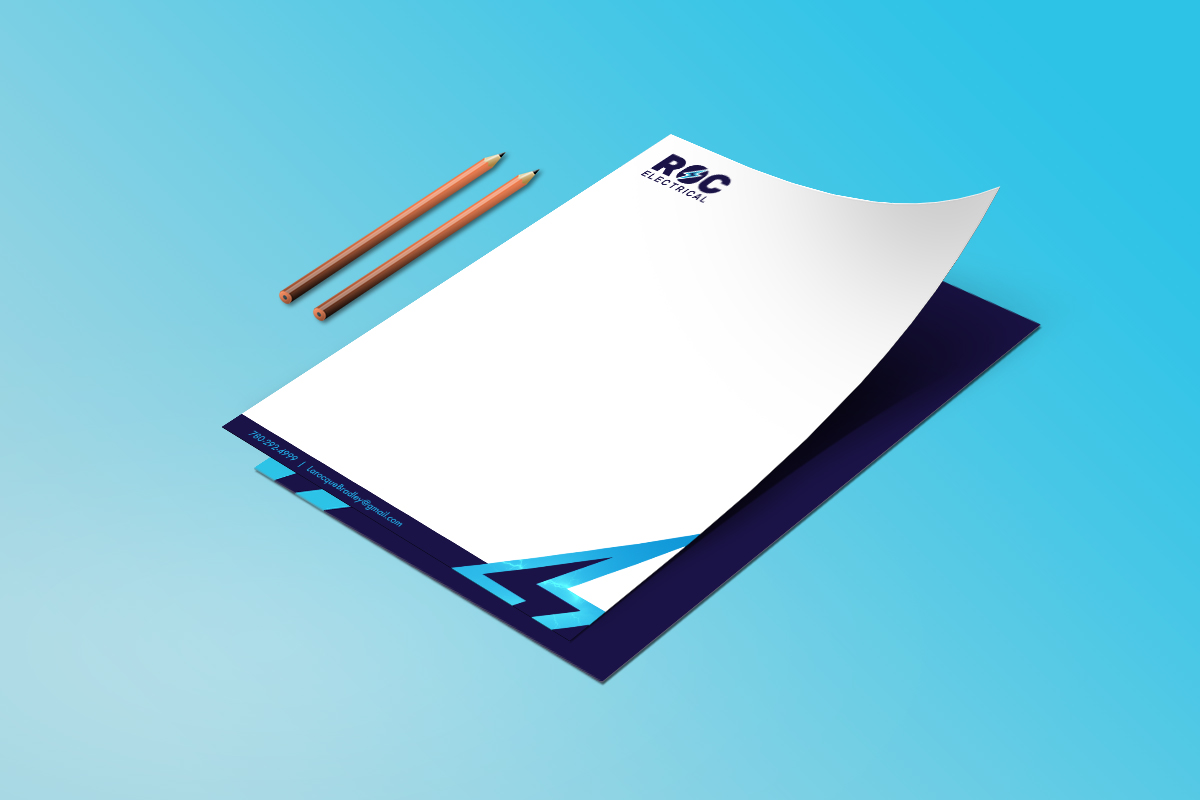
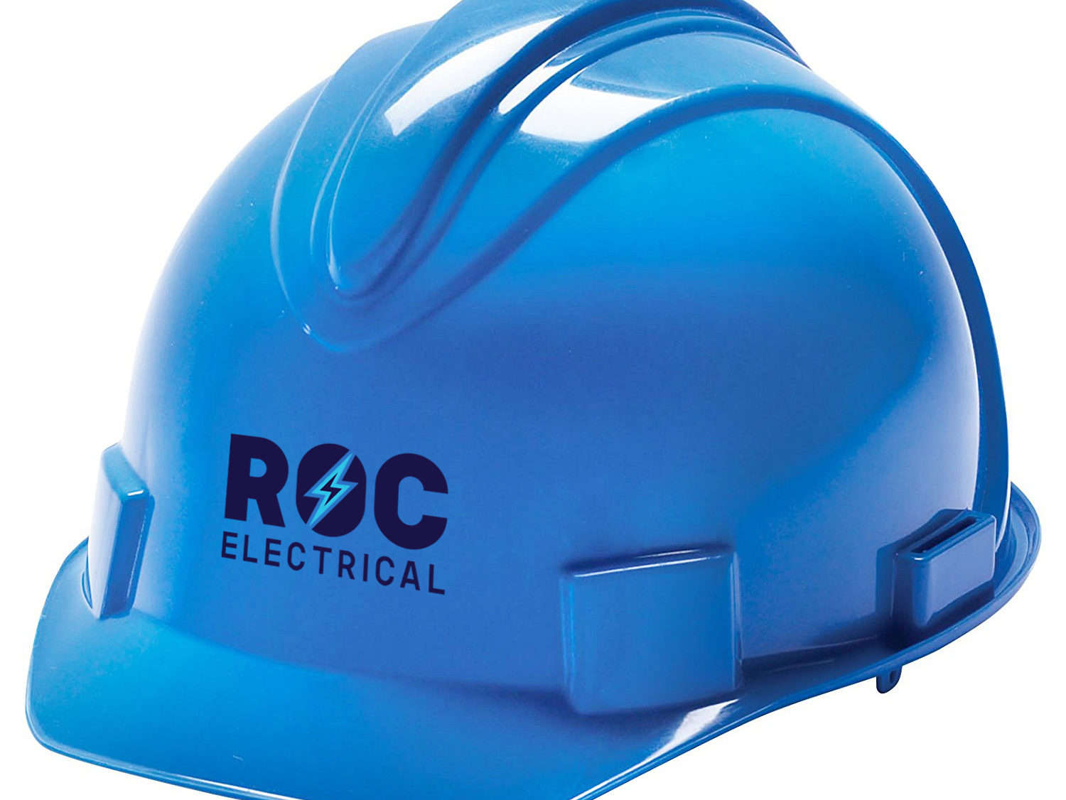
We developed a colour palette of dark, moody blues that would feel professional and intense. These darker tones are complemented by a lighter, vibrant blue that helps to ensure the brand does not lack personality, and that it stands out against the bounds of typical trades logos that are present in central Alberta. In addition, the bold sans-serif typeface perfectly captures the bold, straight-to-the-point personality of the company.
Lightning textures are used as a secondary element and, especially when combined with the lightning bolt icon, it helps to immediately indicate the industry of the company in a creative way.